Norlander
An identity built to go further.
A premium identity for Norlander expedition vehicles, developed from the engineering heritage of Camperspol. One visual language, from the first mark to a presence on the road.

Norlander
An identity built to go further.

From a mark to a moving brand.
- 01
The brief
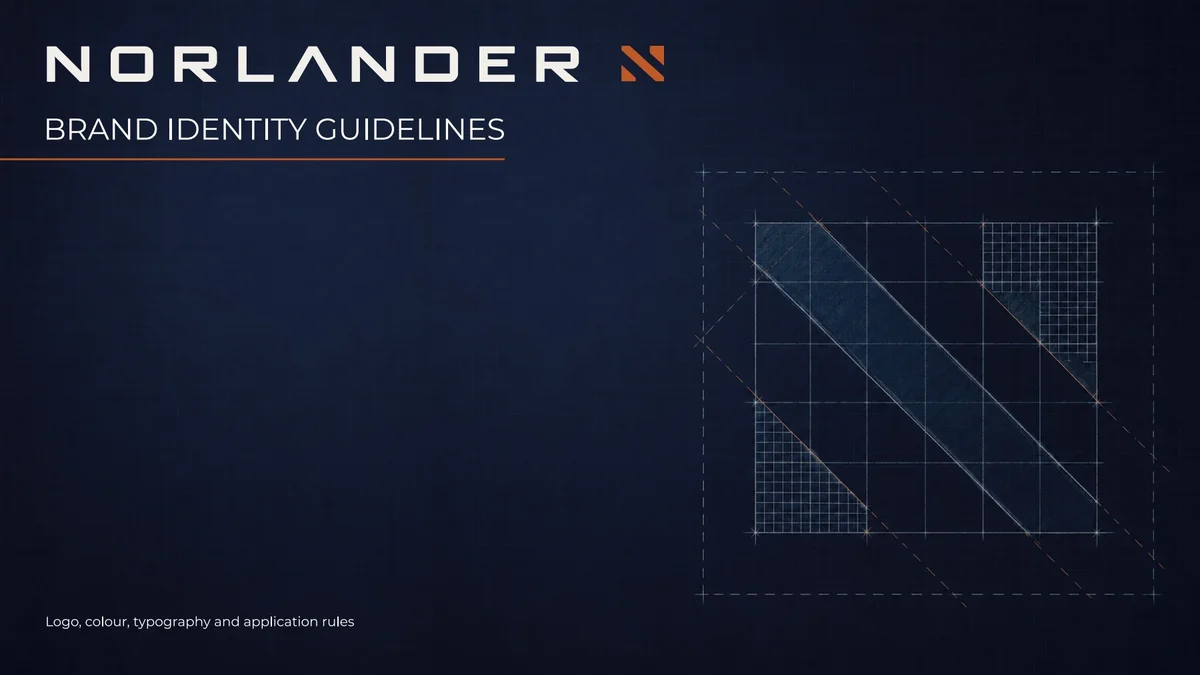
Give Norlander a premium identity, grounded in the engineering heritage of Camperspol.
- 02
The idea
A distinctive mark, purposeful typography and a consistent visual system that can travel between very different scales.
- 03
The execution
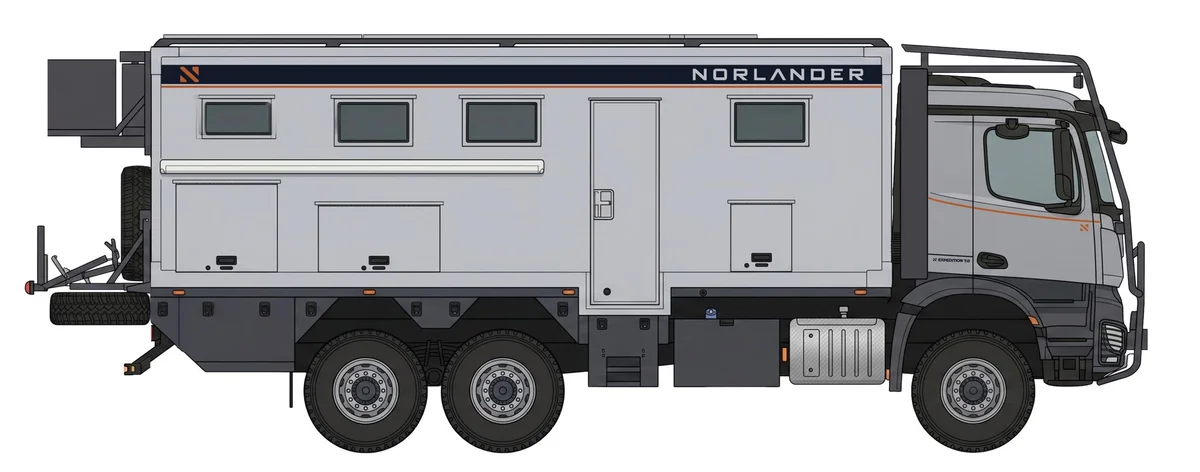
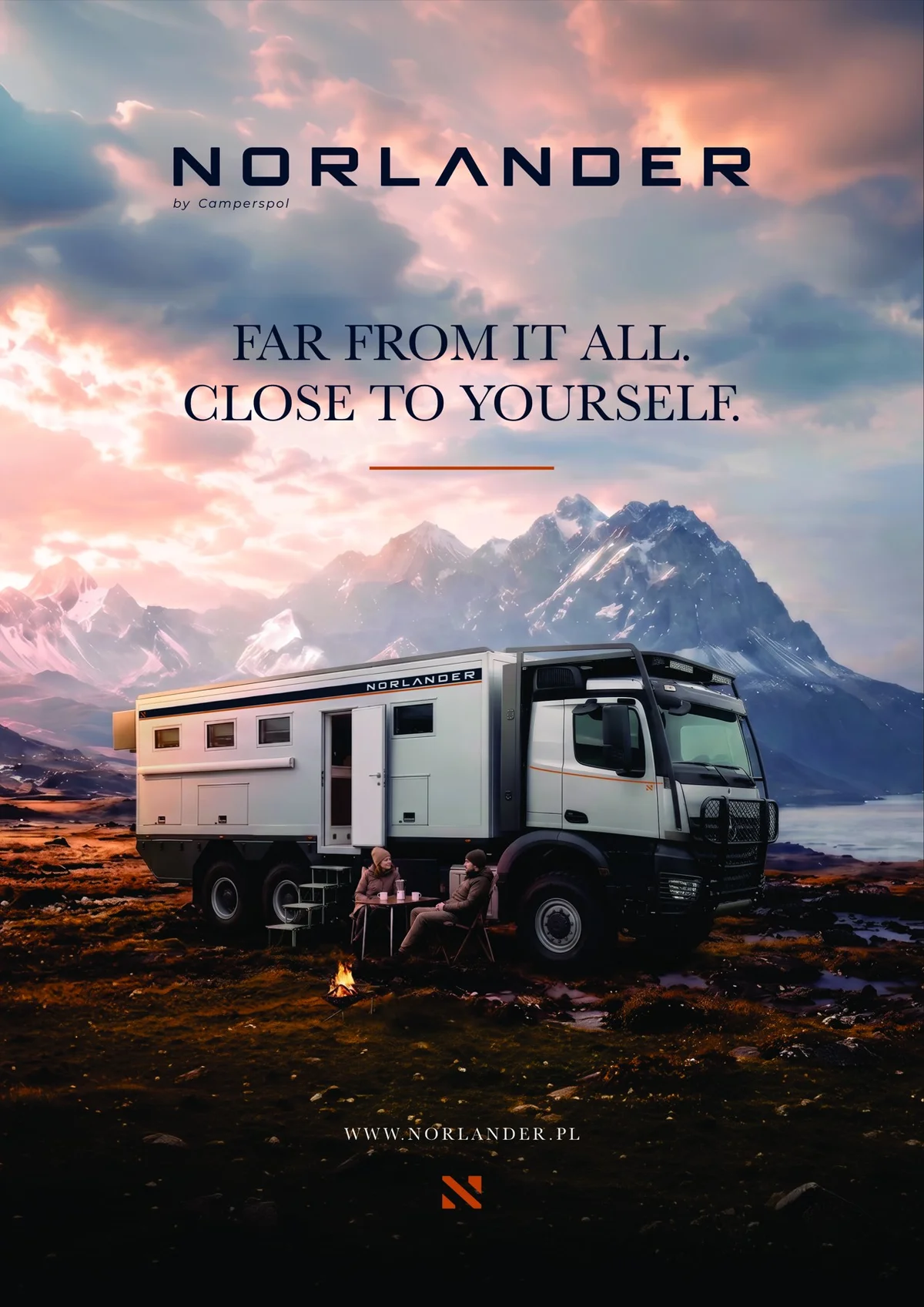
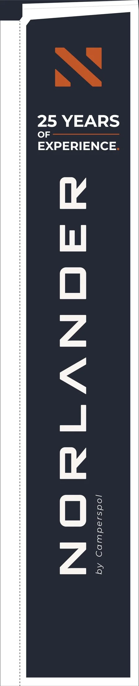
Carry the identity into vehicle livery, printed communication, exhibition materials and launch artwork.
- 04
The learning
Scale is part of the design problem. The mark has to keep its character on a printed page and on the side of a vehicle.
An expedition vehicle brand with an engineering heritage and a new identity to bring into the world.
Brand identity, typography, guidelines, vehicle graphics, print, exhibition and launch creative.
- Brand identity
- Typography & guidelines
- Vehicle graphics
- Print & launch creative
The notes focus on the brief, visual approach and execution behind the selected work.